Every winter, the major paint brands release their color forecasts for the year ahead, and every winter, homeowners scroll through them wondering which ones will actually look right on their own walls. The 2026 lineup leans warmer and quieter than the last few years, which happens to suit the kind of homes common across Fairfield County: classic architecture, good natural light, and rooms that are meant to be lived in rather than just photographed.
Trend forecasts are a useful starting point, but they are not a substitute for thinking through your own home’s light, layout, and the mood you actually want in each room. A deep espresso wall that looks stunning in a magazine spread can feel heavy in a north-facing dining room with limited daylight.
This is the season when a lot of interior work gets booked here, since fall and winter are when Connecticut homeowners shift indoors and start planning interior painting projects for the months ahead. Knowing what is trending, and more importantly why it works, makes that planning easier.
In this article, you will learn about:
- The color direction defining 2026 across major paint brands
- How this year’s palette fits Connecticut’s older architecture
- Room-by-room ideas for using the new colors well
- How to choose confidently instead of guessing at a swatch
Keep reading to see how this year’s palette can shape a home that still feels like yours five years from now.
What is actually trending in 2026
Paint brands do not coordinate their color-of-the-year picks, so when several of them land in the same neighborhood, it tells you something real about where design is heading. This year, that shared direction is warmth, depth, and a move away from the flat, cool grays that dominated the last decade.
The shift toward warm neutrals and deep tones
Sherwin-Williams named Universal Khaki its color of the year, a warm, sandy neutral with a faint green undertone built to sit between beige and taupe. Benjamin Moore went a different direction with Silhouette, an espresso brown layered with soft charcoal notes inspired by tailored menswear. Behr rounded things out with Hidden Gem, a smoky jade dark enough to anchor a room without reading as a bold accent color, a shift that echoes the direction covered in modern interior painting solutions for 2026.
- The common thread across these picks is depth, not brightness
- Warm undertones (red, yellow, brown) are replacing the cooler blue-gray tones popular a few years ago
- Deep, saturated colors are being positioned as wall colors, not just accent trim
None of this means every wall in your house needs to turn dark. It means the palette available to you this year rewards a little more confidence than the safe greige of recent seasons.
Why this direction suits Connecticut’s older homes
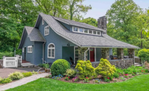
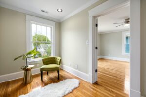
Fairfield County has a large share of pre-war and mid-century homes with real architectural detail: crown molding, built-ins, deep window casings. According to the U.S. Census Bureau’s American Community Survey, the housing age data it collects nationwide shows Fairfield County’s median home construction year sitting around 1967, decades earlier than most of the country, which explains why so many local rooms still have the trim and millwork these deeper colors were built to complement. Warm, grounded colors tend to suit that kind of woodwork far better than the cooler, flatter tones that fit more modern, minimalist interiors, which is part of why decorative interior painting has picked up alongside this year’s forecast.
- Deep neutrals draw attention to millwork and architectural detail instead of competing with it
- Warm undertones read well against the natural light Connecticut homes get through mature trees and traditional window placement
- These colors also photograph and show well for homeowners preparing to sell, since they read as intentional rather than a rental-neutral default
How to use a trend color without overcommitting
A color-of-the-year pick is a starting point, not a mandate. The smartest way to use this year’s direction is to treat the deep, warm tones as anchor colors in one or two rooms, then build lighter, complementary neutrals around them elsewhere in the home, an approach a good interior color consultation can help map out room by room.
- Use a deep tone in a room with strong natural light, where it will not feel heavy
- Pair it with a warm white or soft tan trim rather than a stark, cool white
- Save the boldest colors for spaces you spend intentional time in, like a dining room or a study, rather than high-traffic hallways
Bringing the palette into living spaces
Trend colors matter less as abstract swatches and more as decisions inside a specific room with specific light and use. Living rooms and bedrooms are where most of this year’s palette earns its keep.
Living rooms and shared spaces
Living rooms carry the most foot traffic and the most furniture, which means the wall color needs to hold up visually against a lot of competing elements: upholstery, art, natural light changes throughout the day. This year’s warm neutrals work well here because they flex with different furniture tones rather than fighting them.
A warm, mid-depth neutral on the main walls, paired with a slightly deeper accent wall in the same family, creates the layered look several 2026 palettes are built around. This avoids the flat, single-tone look that made rooms feel closer to a builder-grade rental than a finished home.
- Keep trim in a warm white to avoid a cold contrast against a deeper wall color
- Test how the color reads against existing upholstery and rugs before committing to a full room
- Consider a soft interior wall makeover approach if the room only needs refreshing rather than a full color change
Bedrooms and quieter spaces
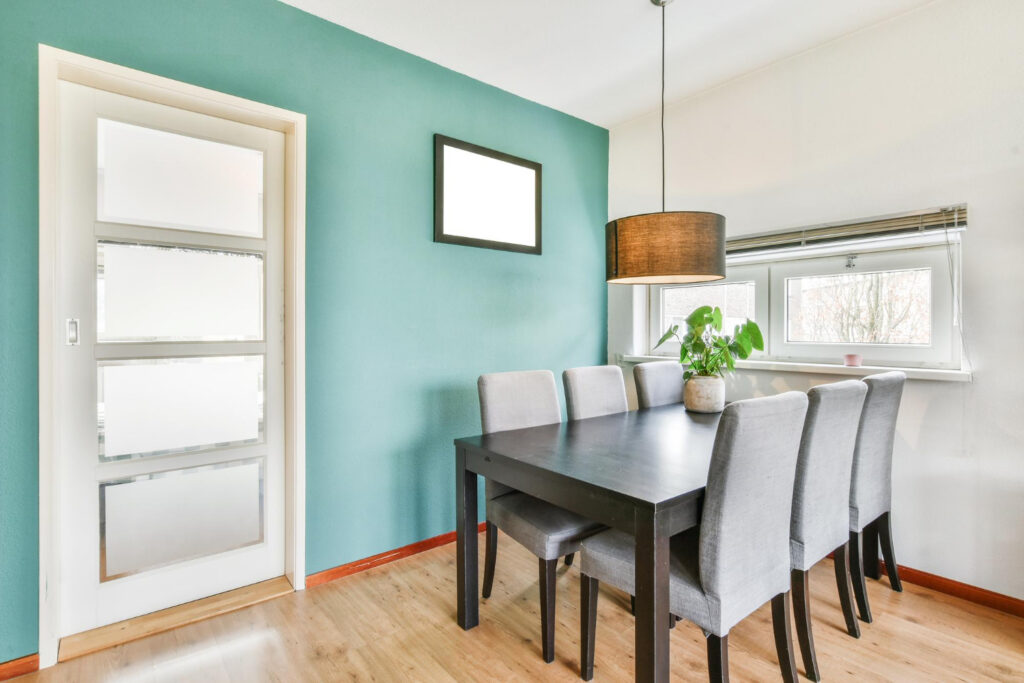
Bedrooms are where the deeper, moodier tones from this year’s palette tend to shine, since the goal in these rooms is calm rather than energy. An espresso-toned wall or a smoky jade accent wall behind a headboard can make a bedroom feel considerably more finished without requiring a full room of dark color.
- Deep tones work especially well on a single accent wall in a bedroom with good natural light
- Lighter, warm-toned ceilings keep a dark-walled bedroom from feeling closed in
- Consider testing a sample directly behind where the bed will sit, since that wall gets the least disruption from doors, closets, and furniture placement
Home offices and multi-use rooms
Home offices have become a permanent fixture in a lot of Fairfield County homes, and the color decisions here tend to favor focus over drama. A warm, grounded neutral works better in most home offices than a bold accent, simply because the room needs to support long hours of concentration rather than make a strong visual statement.
- A mid-tone neutral wall paired with a deeper trim color gives definition without becoming distracting
- Consider how the wall color reads on video calls, since many home offices double as the backdrop for work meetings
- Save bolder colors for a home office with a door that closes, where the mood can shift more dramatically without affecting the rest of the house
Bringing the palette into working rooms
Kitchens, bathrooms, and other high-use spaces need a different conversation from living areas, mostly because of moisture, ventilation, and durability rather than color trends alone.
Kitchens, bathrooms, and high-moisture rooms
Kitchens and bathrooms deserve their own approach, mainly because of ventilation and air quality rather than color trends themselves. These rooms benefit from paints formulated for moisture resistance, and the color choice matters less than the finish and formulation, a distinction covered in the difference between primer and paint.
Older cabinetry and trim in these rooms deserve extra care during prep, since the Environmental Protection Agency estimates that around 24 percent of homes built between 1960 and 1978 still carry some lead-based paint, a range that covers a meaningful share of Fairfield County’s kitchens and bathrooms.
According to the U.S. Environmental Protection Agency, concentrations of many volatile organic compounds are consistently higher indoors, and in some cases up to ten times higher, than they are outdoors, and freshly painted rooms are one of the more common contributors to that spike. Low-VOC and zero-VOC formulations, now standard from most major brands, reduce that concern considerably while still supporting this year’s full color range.
- Choose a satin or semi-gloss finish for bathrooms and kitchens to handle moisture and cleaning
- Ventilate the room well during and after painting, especially in smaller bathrooms with limited airflow
- Ask your painting company which lines they use and whether low-VOC options are available in the color you want
Baseboards, trim, and the details that tie a room together
The wall color gets most of the attention, but trim and baseboards do a lot of the work in making a room feel finished. A warm white or soft tan trim, paired with this year’s deeper wall tones, is what keeps a room from feeling like two competing decisions instead of one cohesive plan, a detail covered further in expert tips for baseboard painting.
- Match trim sheen to the room’s use, favoring more durable finishes in hallways and kids’ rooms
- Keep trim color consistent across connected rooms so sightlines between spaces feel intentional
- Address any peeling or damaged trim before repainting rather than painting over the problem
Preparing the room before the color goes on
A great color choice only pays off if the surface underneath is ready for it. Older Fairfield County homes especially benefit from proper prep before a new coat, a process outlined in how to prepare your CT home for interior painting.
- Patch and sand any damaged drywall or plaster before priming
- Clean walls thoroughly, especially in kitchens where grease and grime build up near cooking areas
- Prime over any stains, water marks, or repairs so the new color goes on evenly
Choosing colors with confidence instead of guessing
The hardest part of any interior repaint is rarely the paint itself. It is standing in a room holding four different swatches and trying to picture how they will actually look once they are on every wall, in every light, at every hour of the day.
Why lighting changes everything
The same color can look completely different in a room that gets strong morning light compared to one that only sees indirect afternoon sun. Connecticut’s seasonal light shifts dramatically too, which means a color chosen in the bright days of summer can read very differently once winter’s lower light angle sets in.
- Test swatches on the actual wall, not just a small board, and view them at different times of day
- North-facing rooms tend to need warmer undertones to avoid feeling flat or cool
- South and west-facing rooms with strong afternoon light can handle cooler or deeper tones without feeling closed in
Working with a professional color consultation
A lot of the guesswork in choosing a color disappears once you talk through the room with someone who paints Connecticut homes for a living. Professional color consultations exist precisely because trend forecasts are general and your home’s light, trim, and existing furniture are not.
- Bring photos of the room at different times of day if a consultation happens off-site
- Mention any furniture, flooring, or fixed elements the new color needs to work with
- Ask about sample application on your actual walls before committing to full rooms
Timing your project around the season
Interior painting is largely weather-independent compared to exterior work, which makes fall and winter a natural time to plan and book projects in Connecticut. This is also when many painting companies have more schedule flexibility, since exterior work slows down once temperatures drop.
- Booking in late fall often means faster scheduling than the busy spring and summer months
- Interior projects can proceed even during the coldest stretches of a Connecticut winter
- Planning now means a refreshed home in time for the rooms you actually spend the winter in
Conclusion
This year’s color direction rewards homeowners willing to move past the safe, flat neutrals that have dominated interiors for the better part of a decade. Warm tones and confident depth suit the kind of architecture common across Fairfield County, and they hold up well against the natural light and traditional detail found in so many local homes.
None of that means picking blindly off a trend list. The right color still depends on your room’s light, your existing furniture, and how you actually want a space to feel once you are living in it day to day. A trend is a direction, not a decision, and the decision works best when it is made in your own home rather than from a swatch on a screen.
If you are ready to see how this year’s palette looks in your own rooms, GREENHAUS Painting can walk through the options with you and build a plan around your home’s light and layout. Request a free estimate to get started: https://greenhauspainting.com/free-estimate/