The best paint colors for Connecticut homes balance trend, climate, and architecture in a way that few other regions demand. From coastal salt air to dense tree cover and four-season weather, the right palette has to perform as well as it looks.
Picking the right paint colors for your Connecticut home involves more than just choosing shades you like. You need to think about your home’s style, the local climate, and how different colors work with New England’s unique light and seasons.
Color choices for Connecticut homes balance timeless appeal with practical performance, featuring muted tones like soft grays, warm whites, and earthy neutrals that complement traditional architecture while standing up to harsh winters and humid summers. These popular paint colors work well both inside and outside your home.
Your color choices affect how your home looks and feels throughout the year. This guide will help you understand current trends moving away from stark whites, how exterior colors change your home’s appearance, which interior shades create cozy spaces, and what factors matter beyond just personal preference.
In this article, we cover:
- Modern shifts away from bright white exteriors
- Understanding how exterior colors transform outdoors
- Interior paint trends create comfortable spaces
- Potential pitfalls of trend-forward paint choices
- Factors to consider beyond personal taste
Keep reading to choose a palette that fits your home’s architecture, holds up to Connecticut’s seasons, and protects your property value for years to come.
Modern shifts away from bright white exteriors
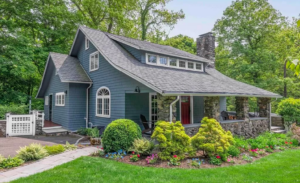
Homeowners in Connecticut are moving away from stark white exteriors toward softer, warmer alternatives that work better with the state’s natural surroundings and changing light conditions. These newer choices include creamy off-whites, earth tones, and thoughtful dark accents that create more depth.
Warm neutrals in natural light
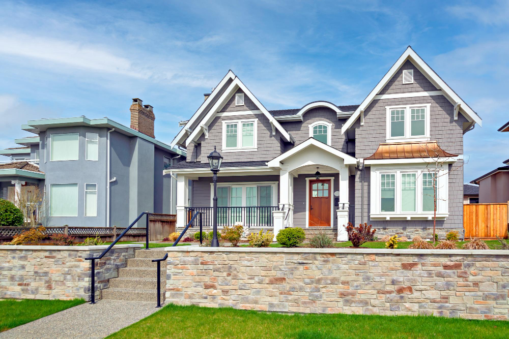
Off-white and greige tones have become the go-to choices for modern exterior paint colors in 2026. Benjamin Moore White Dove OC-17 stands out as a popular option because it has a creamy warmth instead of a cold, sterile appearance.
These softer whites adapt well to Connecticut’s variable weather and lighting. Your home will look balanced whether the sun is shining directly on it or clouds are covering the sky.
The appeal of warm neutrals comes from their ability to feel fresh without being harsh. They pair well with both traditional colonial homes and modern builds throughout the state.
Earth-tone colors complement local landscapes
Connecticut’s wooded areas and seasonal changes make earth tones a natural fit for exterior paint. According to the Connecticut Department of Energy and Environmental Protection, about 60 percent of Connecticut is covered in forest, which is why warm taupes, soft greiges, and muted sage greens tend to blend so naturally with the surrounding environment.
These shades work especially well if your property has mature trees or natural stone features. They create a cohesive look that feels rooted in place rather than standing out awkwardly.
Earth tones also age gracefully as they don’t show dirt and weathering as obviously as bright white does. This practical benefit matters in a state with four distinct seasons and varying weather conditions.
Using dark trim for stronger contrast
Dark trim colors create visual interest when paired with softer main exterior colors. Navy blues, charcoal grays, and deep black trims have gained popularity as alternatives to traditional white trim.
This approach adds definition to architectural details like window frames, shutters, and door surrounds. Your home’s features become more pronounced without requiring a bold color on large surface areas.
The contrast between warm neutral siding and dark trim gives homes a contemporary edge while still respecting Connecticut’s architectural heritage. Benjamin Moore Hale Navy works well for this purpose, providing depth without overwhelming the overall design.
Understanding how exterior colors transform outdoors
Exterior paint colors change dramatically based on light exposure, shadows, and the materials around them. Your home’s final appearance depends on these factors working together throughout the day.
Impact of sunlight on gray and beige hues
Direct sunlight brightens paint colors by up to two shades lighter than they appear on a sample card. Gray paint can look almost white on a south-facing wall during midday, while beige tones take on a warmer, yellow cast.
North-facing walls receive less direct sun and show colors closer to their true shade. Your gray might maintain its intended tone on these surfaces. According to the National Renewable Energy Laboratory, surfaces facing east and west receive sharply different solar exposure throughout the day compared to south-facing walls, which is why paint appears lighter in afternoon sun and darker in morning or evening shade.
Modern house colors like cool grays need extra attention in full sun. They can lose their contemporary edge and appear washed out. Test your color on different sides of your home before committing to the full job.
Beige works well in Connecticut’s varied light because it adapts without losing character. The color stays neutral even when sunlight adds warmth to it.
Cooler appearances in shaded homes
Trees and nearby structures create permanent shade that makes colors look darker and more saturated. Your chosen paint will appear one to two shades deeper in these areas compared to sunny spots.
Blues and greens intensify under shade and can look bold or even harsh. Warm colors like cream or tan lose some brightness but maintain a welcoming feel. Gray becomes richer and shows more of its undertones when protected from direct light.
Check your color in morning and evening light if your home sits in shade most of the day. The difference between dawn and dusk can reveal unexpected green or purple undertones in neutral colors.
Influence of brick and stone accents
Brick pulls warm red and orange tones from nearby paint colors. A neutral beige next to red brick takes on a peachy appearance. Gray paint shifts toward purple or blue when placed against warm masonry.
Stone accents in tan, gray, or white shades require paint colors that complement rather than match. Your siding should be either lighter or darker than the stone by at least two shades for clear definition.
Common brick and stone pairings:
- Red brick works with cream, soft white, or charcoal gray
- Gray stone pairs with navy, forest green, or warm white
- Tan stone complements sage green, brown, or crisp white
Test paint samples directly on your siding next to these permanent features. The interaction between materials creates the final look that passersby will see.
Interior paint trends create comfortable spaces
Connecticut homeowners are choosing paint colors that bring warmth and balance to their living spaces. These selections move away from cold, stark finishes and favor colors that connect indoor spaces with the natural landscape outside.
Warm whites replace stark tones
Bright white walls are giving way to warmer white shades in Connecticut homes. These softer whites have undertones of cream, beige, or light gray that create a more inviting feel than pure white paint.
You’ll find these warm whites work well in rooms with lots of natural light. They reflect light without the harsh glare that stark white can produce. The subtle warmth makes spaces feel more comfortable while still keeping rooms bright and open.
These shades pair easily with wood trim and flooring common in Connecticut homes. They also work as a backdrop for both modern and traditional furniture styles. Popular warm white options include colors with names like “Swiss Coffee,” “Alabaster,” and “Linen White.”
Deep greens and blues for balanced contrast
Rich green and blue paint colors are showing up in Connecticut living rooms, bedrooms, and home offices. These deeper shades create a strong visual impact while maintaining a calm atmosphere.
Green options include:
- Forest green
- Sage green
- Olive green
- Hunter green
Blue choices range from:
- Navy blue
- Slate blue
- Teal
- Deep ocean blue
These colors work particularly well as accent walls or in rooms where you want a cozy feeling. They connect your interior spaces to Connecticut’s natural surroundings like the Long Island Sound and wooded areas. Deep blues and greens also hide imperfections better than lighter colors and need less frequent touch-ups.
Soft natural colors in open floor plans
Muted earth tones help define different areas in open floor plans without breaking up the visual flow. Soft mauve, light terracotta, and warm taupe shades create gentle transitions between kitchen, dining, and living spaces.
These natural colors complement the wood elements and stone features common in Connecticut architecture. They also coordinate well with the warm whites mentioned earlier, allowing you to use multiple colors throughout connected spaces.
Lighter natural shades keep open areas feeling spacious while adding more personality than all-white walls. You can use slightly different shades of the same color family to mark different zones without creating harsh boundaries. This approach maintains the open feel while giving each space its own identity.
Potential pitfalls of trend-forward paint choices
Trendy paint colors can make your Connecticut home feel dated faster than you expect. Understanding the long-term impact of bold color choices helps you make decisions that work for your lifestyle and budget.
Resale risks of bold accent colors
Bold accent colors like bright orange, deep purple, or electric blue can hurt your home’s resale value. Buyers often struggle to see past strong wall colors when they tour properties. They calculate the time and money needed to repaint before making an offer.
Real estate agents report that homes with intense accent walls typically sit on the market 15-20% longer than similar homes with neutral tones. Buyers may offer less money to account for repainting costs. A vibrant teal accent wall in your living room might appeal to your personal taste, but it narrows your buyer pool significantly.
According to the U.S. Census Bureau, housing market conditions and homeowner turnover vary by region, but homes priced to compete in any market benefit from broad buyer appeal, which neutral wall colors support. Your favorite shade of hot pink may reflect your personality, but it creates an obstacle during selling season.
Benefits of timeless shades for large areas
Classic colors like soft whites, light grays, and warm beiges create lasting appeal in bedrooms, living rooms, and hallways. These shades adapt to different furniture styles and decor changes over the years. You can swap out throw pillows, artwork, and rugs without worrying about color clashes.
Timeless paint colors also photograph well for listing photos. They make rooms appear larger and brighter, which appeals to most buyers. You won’t need to repaint before selling, saving you hundreds or thousands of dollars.
These neutral foundations let you add personality through accessories rather than permanent wall colors. Your taste will evolve over time, and neutral walls make those transitions easier and less expensive.
Advantages of neutral palettes for flexibility
Neutral palettes give you freedom to experiment with furniture, textiles, and decorative items. You can shift from coastal to farmhouse to modern styles without repainting. This flexibility matters in Connecticut’s seasonal climate, where you might want lighter, brighter decor in summer and richer textures in winter.
Neutral walls also work better with Connecticut’s natural light patterns. The state’s varying sunlight throughout the year can make trendy colors look different from morning to evening. Beiges and grays maintain consistency across different lighting conditions.
Your neutral base lets you test bold colors through removable elements first. Try a bright yellow lamp or teal curtains before committing to painted walls.
Factors to consider beyond personal taste
Picking colors for your Connecticut home involves more than choosing shades you like. Your roof color, the homes around you, and testing samples in real conditions all affect how your final choice will look.
Role of roof color in paint selection
Your roof is one of the largest visual elements of your home’s exterior. The color you choose for your siding needs to work well with your existing roof shingles.
If you have a dark gray or black roof, lighter paint colors like white, cream, or light gray create a clean contrast. These combinations are common in Connecticut’s colonial and coastal homes. A brown or terracotta roof pairs well with warm neutrals such as beige, tan, or sage green.
Cool-toned roofs in gray or blue work best with cooler paint colors. Try shades like soft blue, cool white, or dove gray for a unified look.
Red or burgundy roofs limit your options more than neutral roofs. Stick with white, cream, or muted earth tones to avoid clashing. Dark roofs also make lighter paint colors stand out more, which can increase your home’s curb appeal.
Effect of neighborhood style on curb appeal
Your home exists within a larger community setting. The architectural styles and color schemes around you should guide your decision.
Connecticut neighborhoods often feature specific design patterns. Historic districts may have colonial or Victorian homes in traditional whites, grays, and muted blues. Coastal areas typically use lighter shades that reflect beach environments.
You don’t need to match your neighbors exactly. But choosing colors that complement the general palette keeps your home from looking out of place. A bright orange house on a street of neutral colonials will stand out in ways that hurt resale value.
Look at the permanent fixtures in your area too. Stone foundations, brick chimneys, and trim materials common to your neighborhood should influence your color choice. These elements create visual harmony across your street.
Value of professional paint samples
Small paint chips in a store look different than large surfaces in natural light. Testing samples on your actual home shows you the true color.
Buy sample sizes of your top three to five choices. Paint sections at least two feet by two feet on different sides of your home. North-facing walls show cooler tones, while south-facing walls get warm, direct sunlight.
Check your samples at different times of day. Morning light, midday sun, and evening shadows all change how colors appear. What looks perfect at noon might seem too dark at dusk.
Leave samples up for at least a week. Connecticut weather changes quickly, and you need to see how your colors look in sun, clouds, and rain. This step prevents expensive mistakes and helps you commit to a choice that works in all conditions.
Conclusion
Picking the right paint color for your Connecticut home makes a real difference in how it looks and holds up over time. The colors you choose should work with your home’s style and fit in with the local area.
Think about your home’s architectural features when you make your choice. Colonial homes look great with traditional colors, while modern builds can handle bolder options. Your neighborhood matters too. Take a look at nearby homes to get a sense of what works well in your area.
The best color for your home balances what you like with what works in Connecticut. Classic whites, grays, and blues stay popular because they suit New England architecture. But you can also choose something that shows your personal style.
Your exterior paint job will last seven to ten years with proper care. This means your color choice is important but not permanent. You can always change it later if your taste changes or you want to update your home’s look.
Start by narrowing down your options to a few colors you like. Then get sample pots and paint test sections on your home’s exterior to see how they actually look. When you’re ready to bring your color vision to life, request a free estimate from Greenhaus Painting and work with a team that knows how Connecticut light, weather, and architecture shape the final result.